Typographic systems with Theme UI
Throughout my developer journey, I’ve longed for an easy way to create and use styles that were available outside of specific css selectors. I wanted styles to be:
- semantically meaningful
- decoupled from particular classes, attributes, or components
- scoped, but accessible from any component
Over time, I’ve used a range of solutions such as SASS variables, CSS variables, and utility classes to accomplish this general purpose, but many lacked greater composition capabilities, particularly for typography.
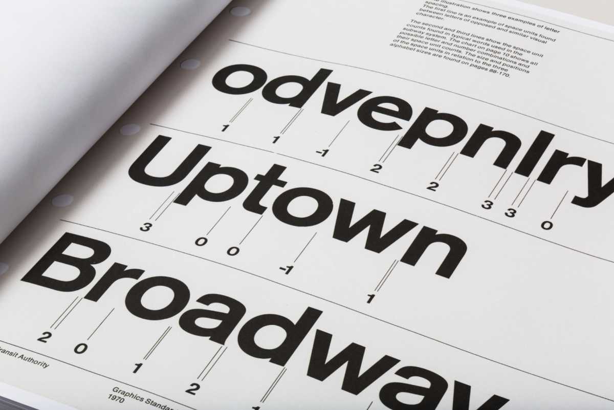
Page from NYCTA Graphics Standards Manual showcasing Massimo Vignelli’s fine attention to typographic detail.
Most recently,though, I’ve started to pair Theme UI with Gatsby. Theme UI is a library that allows developers to build scalable and maintainable design systems through the use of design tokens. Design tokens are javascript objects that house shareable styles for an entire site. They look something like this:
// design token pseudo-codevar styles = {colors: {primary: "#9114CC",secondary: "#00994D",muted: "#FBFAFF",},};
They can then be used in components like this:
// design token pseudo-code<div style={{ backgroundColor: styles.colors.primary }}>Hello World</div>
The idea is that styles are associated with semantic naming conventions, like primary, and can be accessed by any component.
As I’ve continued to use Theme UI and dig into their documentation, I’ve found several helpful paradigms for code reusability. One of my favorites is text variants, and today we’ll be walking through how to leverage them to create typographic systems within a Gatsby site.
Here’s a quick glimpse of what we will building today:
- A working knowledge of React
- Familiarity with Gatsby is beneficial, though not essential
- You can find the code for this tutorial here on Github
Kicking off a Gatsby Site
Gatsby is a framework built around React that enables developers to quickly deploy highly performant websites. If you haven’t used Gatsby before, and are interested in learning more, I highly recommend working through their starter tutorial. Alright, let’s get started!
First, create a new folder called typographic-systems-themeUI on your desktop. Then, in your terminal, change into this new directory:
cd ~/desktop/typographic-systems-themeUI
Next, let’s clone Gatsby’s hello world starter. In your terminal, run:
# note the "." at the endgit clone git@github.com:gatsbyjs/gatsby-starter-hello-world.git .
For our last step, let’s install our dependencies:
yarn install
Let’s see what we have and run Gatsby’s localhost dev environment:
yarn develop -o
Once we run this command, Gatsby will provide a URL, usually locahost:8000 for us to view our site. If we go to this URL, we should see a tiny “Hello world!”
Setting up Theme UI
Now, let’s wire up Theme UI with our Gatsby site. To do this, let's install the following dependencies:
yarn add theme-ui gatsby-plugin-theme-ui
Once we we install this plugin, we need to configure it in our gatsby-config.js file:
// src/gatsby-config.jsmodule.exports = {/* Your site config here */plugins: [`gatsby-plugin-theme-ui`],};
When Gatsby uses Theme UI, it will look for the file path src/gatsby-plugin-theme-ui/index.js and expect a default export of an object. This object should contain a range of key, value pairs that includes the styles we want to use across our site.
So, in our src directory, let’s create a folder called gatsby-plugin-theme-ui. In this new folder, create a file called index.js.
Our first typographic values
The stage has been set. Now we can start to fiddle with our first version of a type ramp. We will start by creating our theme object in gatsby-plugin-theme-ui/index.js, and populating it with a few font sizes:
// src/gatsby-plugin-theme-ui/index.jsconst theme = {fontSizes: [10, 13, 18, 21, 26, 34, 48],};export default theme;
fontSizes is a predefined Theme Key that maps to the CSS property, font-size. If you would like to learn more, Theme-UI has a whole specification for Theme Keys that map to CSS values. The array of numbers represents different pixel font sizes.
We will go ahead and specify our font families as well:
// src/gatsby-plugin-theme-ui/index.jsconst theme = {fonts: {body:'system-ui, -apple-system, BlinkMacSystemFont, "Segoe UI", Roboto, "Helvetica Neue", sans-serif',},fontSizes: [10, 13, 18, 21, 26, 34, 48],};export default theme;
The fonts keyword maps to the font-family property within CSS, and body could be any name, but we have chosen body because it makes the most semantic sense.
Finally, let’s apply some basic styling to our site. To add base, top-level styles to the <body> element, we can use theme.styles.root:
// src/gatsby-plugin-theme-ui/index.jsvar theme = {fonts: {body:'system-ui, -apple-system, BlinkMacSystemFont, "Segoe UI", Roboto, "Helvetica Neue", sans-serif',},fontSizes: [10, 13, 18, 21, 26, 34, 48],styles: {root: {backgroundColor: "white",margin: "auto",maxWidth: "1080px",padding: "40px",},},};export default theme;
Applying styles with the sx prop
Now that we have our basic type ramp foundation, we can begin using this theme throughout our site. To do this we will need to use Theme UI’s sx prop, so we can style items inline, and a custom jsx pragma, so our inline styles get compiled correctly. This may sound a bit convoluted, but I promise the implementation is quite seamless.
To get started, switch over to your pages/index.js file, and at the top, add the custom /** @jsx jsx */ pragma comment to the top of your module and import the jsx function from theme-ui:
// pages/index.js/** @jsx jsx */import { jsx } from "theme-ui";import React from "react";export default () => <div>Hello world!</div>;
Now, let’s add some base typographic styling. Since sx is a prop that styles elements inline, we will add it directly to our div element, and pass it a javascript object of css styles:
/** @jsx jsx */import { jsx } from "theme-ui";import React from "react";export default () => (<div sx={{ fontFamily: "body", fontSize: "6" }}>Hello world!</div>);
If we stop and restart our server, we should see the following at our localhost:
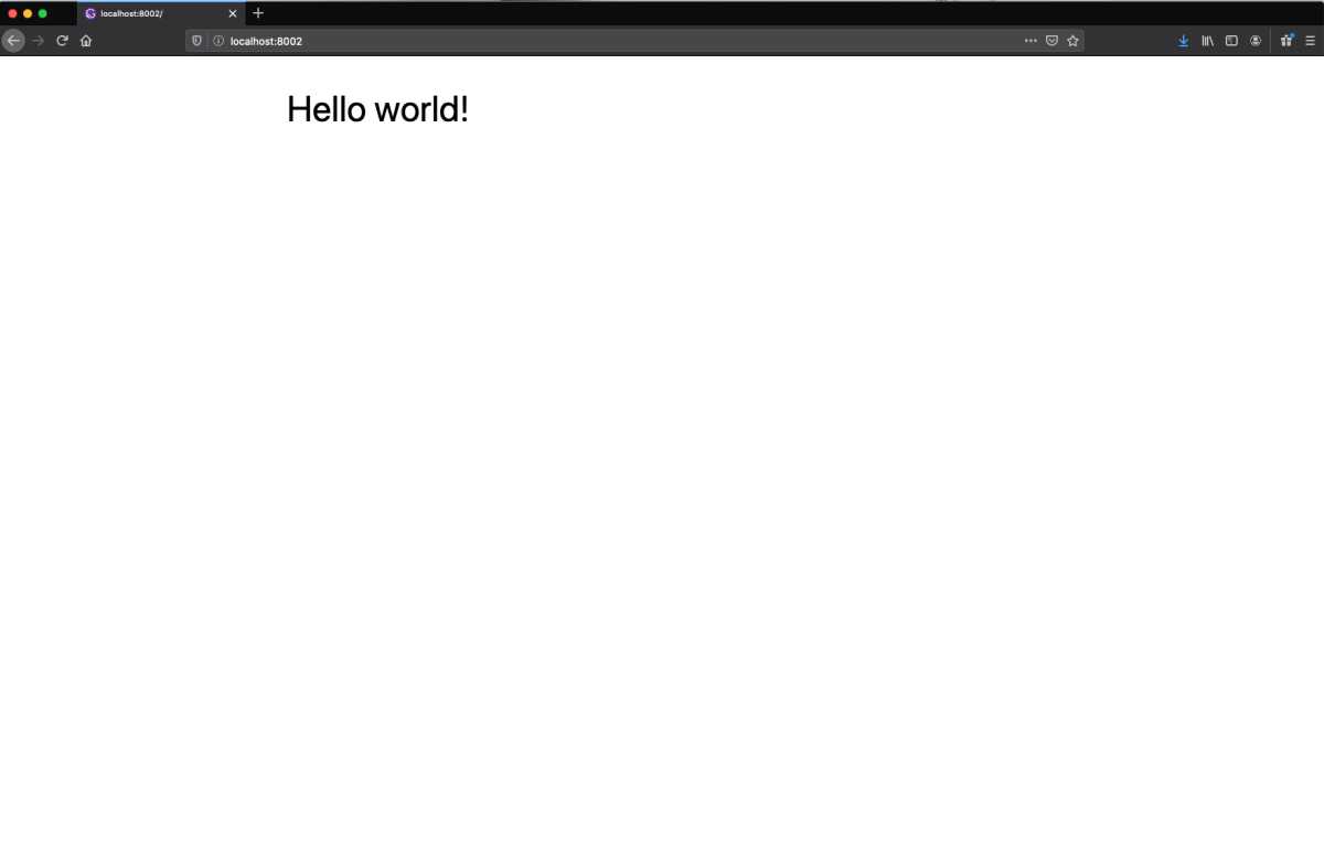
Our sx styles are now styling our div. If you recall in our theme, body is the name of one of our fonts. Likewise, we defined the following fontSizes in our theme object:
// gatsby-plugin-theme-ui/index.jsconst theme = {// ... other theme stylesfontSizes: [10, 13, 18, 21, 26, 34, 48],};
Using javascript’s way of counting items in an array, fontSize: "6" correlates with 48. So our div font size is 48px.
Now that we have a basic understanding of Theme UI, let’s accelerate our pace and start building our type ramp out.
Advancing our type styles
Currently, our type styles are quite flat: a font family and a size. As we discussed though, type is a multidimensional design component. Readability and visual impact are effected by various parameters. So, let’s add some of these in our theme.
Let’s kick it off with font weights, letter spacing, and line heights:
// src/gatsby-plugin-theme-ui/index.jsconst theme = {fonts: {body:'system-ui, -apple-system, BlinkMacSystemFont, "Segoe UI", Roboto, "Helvetica Neue", sans-serif',},fontSizes: [10, 13, 18, 21, 26, 34, 48],fontWeights: {light: 200,regular: 400,medium: 500,bold: 600,heavy: 700,},lineHeights: ["1em", "1.25em", "1.6em"],letterSpacing: ["-0.025em", "0.025em", "0.125em"],// ... more site styles};export default theme;
You may be wondering, why do we need various line heights and letter spacing styles? I don’t want to derail the article to much, but here are a few key typographic insights:
- The larger and bolder your type is, particularly display sizes above 34px, the less letter spacing it needs.
- The smaller your type is, particularly body sizes below 13px, the more letter spacing it needs.
- The shorter the line length the less line height the type needs.
- The longer the line length the more line height the type needs.
Typography is an intricate science with hundreds of years of research and adaptation behind it. If you’re wanting to learn more, I highly recommend Robert Bringhurst’s, “Elements of Typographic Style.”
Updating our page layout
Now that we have more styles in place, let’s update our home page and add some more layers and hierarchy of information. Go ahead and update the pages/index component to the following:
// src/pages/index.js/** @jsx jsx */import { jsx } from "theme-ui";import React from "react";export default () => (<div><h1sx={{fontFamily: "body",fontSize: "6",fontWeight: "heavy",letterSpacing: "0",}}>Hello world!</h1><h4sx={{fontFamily: "body",fontSize: "1",fontWeight: "bold",letterSpacing: "2",textTransform: "uppercase",}}>Authored by John Smith</h4><psx={{fontFamily: "body",fontSize: "2",fontWeight: "regular",lineHeight: "2",letterSpacing: "1",}}>I'm baby craft beer schlitz seitan put a bird on it yr aesthetic.Hexagon street art truffaut chicharrones. Ugh offal cray typewriterlyft paleo. Shoreditch viral tousled ugh shaman. Vinyl pinterestshaman butcher marfa coloring book scenester humblebrag truffaut +1unicorn kitsch. Paleo meggings yr, portland keytar four loko viralpost-ironic literally biodiesel la croix waistcoat. Ramps portlandneutra synth</p></div>);
A few things to note:
- The
sxobject has been updated to include more typographic styles. - The value of these styles are derived from our
themeobject. - The wonderful copy writing is from hipster ipsum.
If we stop and restart our server, we should see the following:
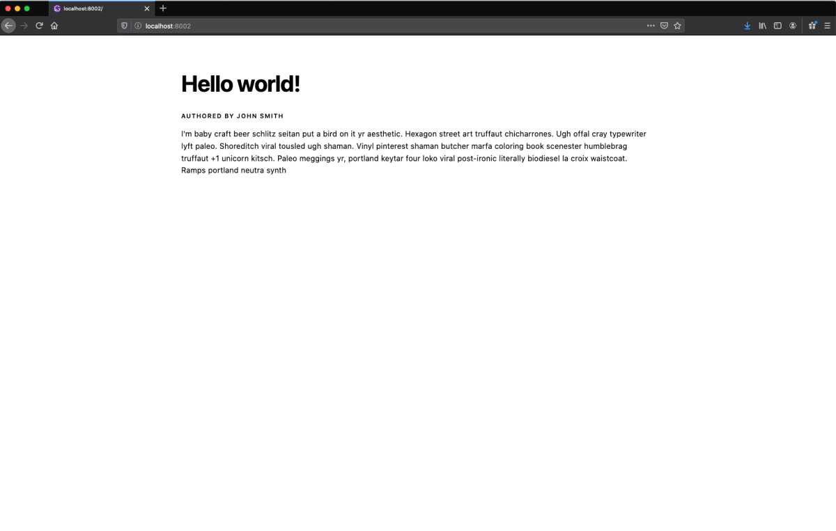
Alright, we have some good initial styling set up. But there’s a problem: none of these sets of typographic styles are reusable. If we want to standardize type styles, we’ll need to either create classes or resort to copy and paste every time we want to apply a paragraph or header style. Thankfully, Theme-UI has provided a more scalable way to build type styles through the use of Text Variants.
Text variants and type ramps
To get started with text variants, we will leverage the type styles we created in our home page. Let’s first define our body, or paragraph, styles. Switch over to the theme object, and add the following text object to theme:
// src/gatsby-plugin-theme-ui/index.jsconst theme = {// ... theme type stylestext: {body: {fontFamily: "body",fontSize: "2",fontWeight: "regular",lineHeight: "2",letterSpacing: "1",},},// ... theme body styles};
We now have our first text variant! And, we referenced the type styles we already defined in the theme object to build this out. Let’s add some more variants:
// src/gatsby-plugin-theme-ui/index.jsconst theme = {// ... theme type stylestext: {body: {fontFamily: "body",fontSize: "2",fontWeight: "regular",lineHeight: "2",letterSpacing: "1",},headline: {fontFamily: "body",fontSize: "6",fontWeight: "heavy",lineHeight: "0",letterSpacing: "0",},caps: {fontFamily: "body",fontSize: "1",fontWeight: "bold",lineHeight: "1",letterSpacing: "2",textTransform: "uppercase",},caption: {fontFamily: "body",fontSize: "1",fontWeight: "regular",fontStyle: "italic",lineHeight: "1",letterSpacing: "1",},sectionHeader: {fontFamily: "body",fontSize: "4",fontWeight: "bold",lineHeight: "0",letterSpacing: "0",},},// ... theme body styles};
We now have a range of type styles for different pieces of information. Let’s use this in our home page.
Switch over to src/pages/index.js and at the top, import the Text component from theme-ui:
/** @jsx jsx */import { jsx, Text } from "theme-ui";import React from "react";// ... more jsx
The Text component contains access to all of the text variants we defined in our theme object. To test this, let’s replace our h1 tag with our Text component.
/** @jsx jsx */import { jsx, Text } from "theme-ui";import React from "react";export default () => (<div><Textsx={{fontFamily: "body",fontSize: "6",fontWeight: "heavy",letterSpacing: "0",}}>Hello world!</Text>// ... more jsx</div>);
Then, remove the sx prop and object, and add the following:
/** @jsx jsx */import { jsx, Text } from "theme-ui";import React from "react";export default () => (<div><Text variant="headline">Hello world!</Text>// ...more jsx</div>);
We are passing the Text component a prop called variant with a value of headline which correlates to the headline text variant we defined in our theme object.
If we stop and restart our server, we should see the following in our localhost:

The lack of visual change indicates that our headline is working correctly. If we inspect this element in our web dev tools though, we will discover that this is no longer an h1 tag, but a div. By default, Theme UI uses divs for our text variants. If we want more semantic html, we can specify which html tag a text variant should use by passing Text the as property:
/** @jsx jsx */import { jsx, Text } from "theme-ui";import React from "react";export default () => (<div><Text variant="headline" as="h1">Hello world!</Text>// ... more jsx</div>);
With our new found knowledge, let’s replace all of our html elements and sx props with their equivalent Text variants:
/** @jsx jsx */import { jsx, Text } from "theme-ui";import React from "react";export default () => (<div><Text variant="headline" as="h1">Hello world!</Text><Text variant="caps" as="h4">Authored by John Smith</Text><Text variant="body" as="p">I'm baby craft beer schlitz seitan put a bird on it yr aesthetic.Hexagon street art truffaut chicharrones. Ugh offal cray typewriterlyft paleo. Shoreditch viral tousled ugh shaman. Vinyl pinterestshaman butcher marfa coloring book scenester humblebrag truffaut +1unicorn kitsch. Paleo meggings yr, portland keytar four loko viralpost-ironic literally biodiesel la croix waistcoat. Ramps portlandneutra synth</Text></div>);
In our localhost, we should see the following:
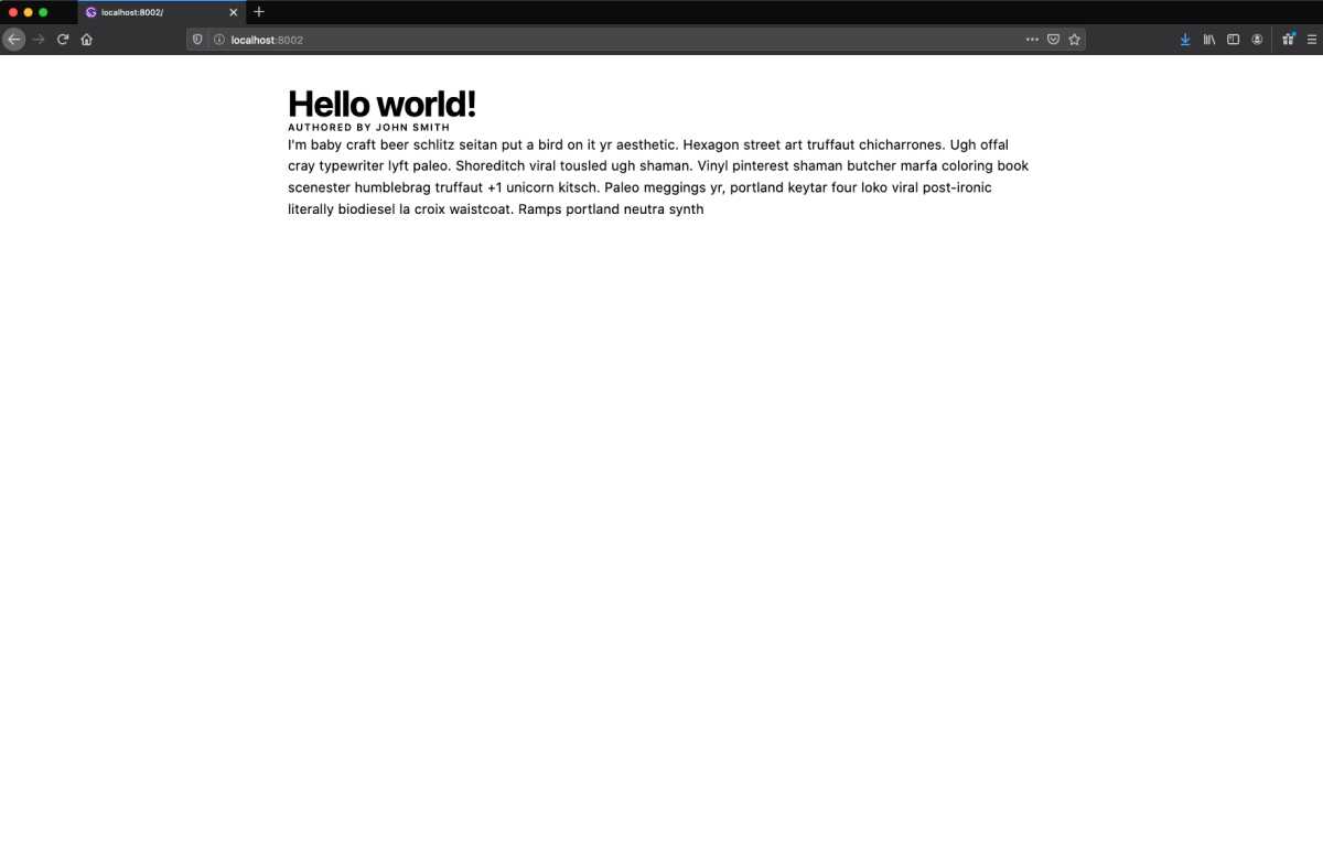
It appears, all of our padding and margin has disappeared. We can easily fix this by adding a space object to our theme object and then leveraging that spacing in our Text variants.
Spacing in Theme UI
Let’s switch back over to our theme object and add the space object to it. This object will hold different spacing increments that can be used across our site:
// src/gatsby-plugin-theme-ui/index.jsconst theme = {// ... theme and root stylesspace: {xxs: 5,xs: 10,s: 15,m: 20,l: 30,xl: 45,xxl: 60,xxxl: 90,},};
Now, let’s update the spacing on our home page. To do this, we will add the sx prop to our Text variants, and leverage our space increments for styling the padding and margin.
Let’s start with our headline:
// src/pages/index.js/** @jsx jsx */import { jsx, Text } from "theme-ui";import React from "react";export default () => (<div><Text variant="headline" as="h1" sx={{ marginBottom: "m" }}>Hello world!</Text>// ... more jsx</div>);
Now this Text variant will use 20px for its bottom margin. Let’s continue to update our other Text variants with some spacing:
// src/pages/index.js/** @jsx jsx */import { jsx, Text } from "theme-ui";import React from "react";export default () => (<div><Text variant="headline" as="h1" sx={{ marginBottom: "m" }}>Hello world!</Text><Text variant="caps" as="h4" sx={{ marginBottom: "xl" }}>Authored by John Smith</Text><Text variant="body" as="p" sx={{ marginBottom: "xs" }}>I'm baby craft beer schlitz seitan put a bird on it yr aesthetic.Hexagon street art truffaut chicharrones. Ugh offal cray typewriterlyft paleo. Shoreditch viral tousled ugh shaman. Vinyl pinterestshaman butcher marfa coloring book scenester humblebrag truffaut +1unicorn kitsch. Paleo meggings yr, portland keytar four loko viralpost-ironic literally biodiesel la croix waistcoat. Ramps portlandneutra synth</Text></div>);
We should see the following in our localhost now:
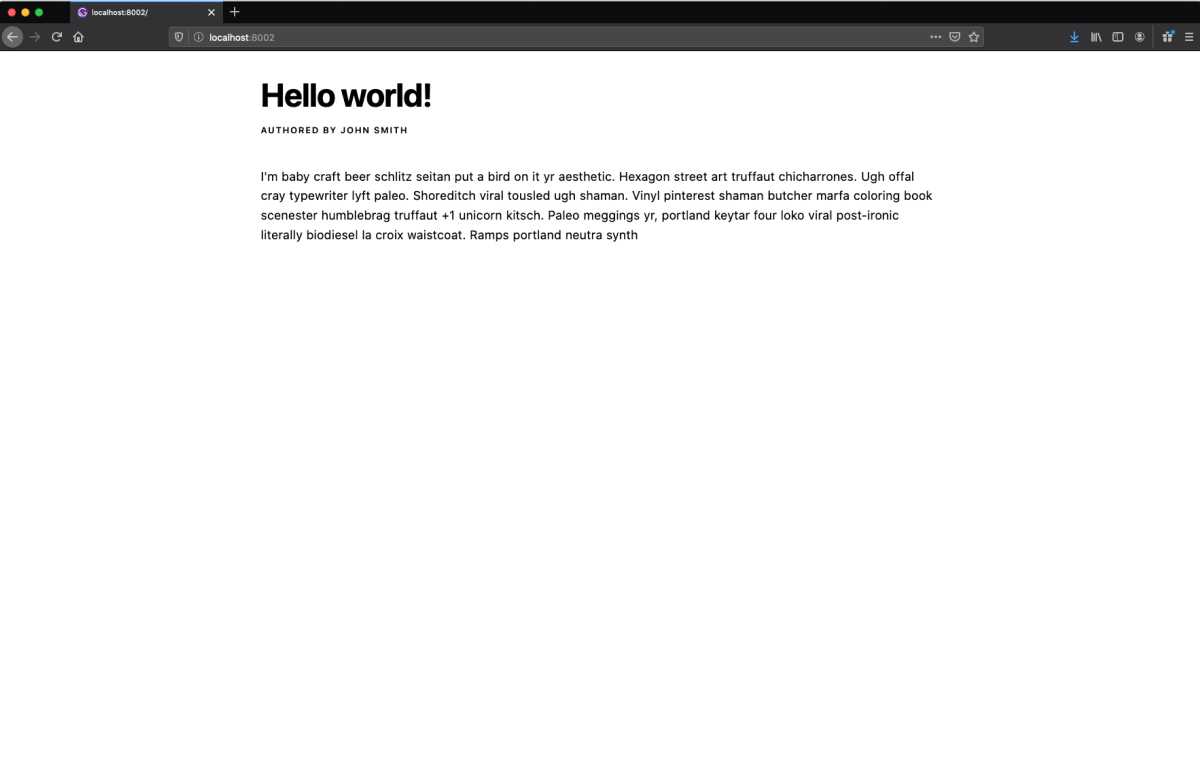
You may be wondering, why didn’t we just define the margin and padding on our text variants in our theme object? The reason we define these in the sx prop instead is so our text variants work in as many situations as possible. In other words, the spacing around our text variants will vary according to their context. This approach incorporates the best practices of reusable code. We purposefully leave margin and padding out of the definition of our text variants, so we can leverage them for a variety of different situations.
Injecting some life into our site
We have now learned how to create Text variants, add css styles through the sx prop, and specialize our theme object. Equipped with this knowledge, we can create lively blog pages with simplicity, composing our Text variants in a range of ways.
Here’s one of the variations I built with my Text variants and images from Pexels:
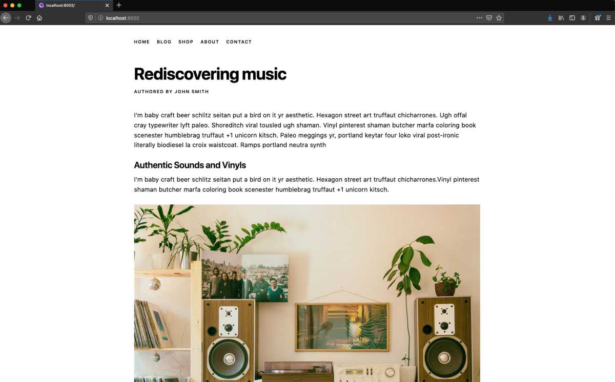
And, here’s the code I updated in my src/pages/index.js file:
// src/pages/index.js/** @jsx jsx */import { jsx, Text } from "theme-ui";import React from "react";export default () => (<div><Textvariant="caps"as="ul"sx={{display: "flex",flexFlow: "row wrap",listStyleType: "none",marginBottom: "xxl",padding: 0,li: {marginRight: "m",},}}><li>home</li><li>blog</li><li>shop</li><li>about</li><li>contact</li></Text><Text variant="headline" as="h1" sx={{ marginBottom: "m" }}>Rediscovering music</Text><Text variant="caps" as="h4" sx={{ marginBottom: "xl" }}>Authored by John Smith</Text><Text variant="body" as="p" sx={{ marginBottom: "xs" }}>I'm baby craft beer schlitz seitan put a bird on it yr aesthetic.Hexagon street art truffaut chicharrones. Ugh offal cray typewriterlyft paleo. Shoreditch viral tousled ugh shaman. Vinyl pinterestshaman butcher marfa coloring book scenester humblebrag truffaut +1unicorn kitsch. Paleo meggings yr, portland keytar four loko viralpost-ironic literally biodiesel la croix waistcoat. Ramps portlandneutra synth</Text><Textvariant="sectionHeader"sx={{ marginTop: "l", marginBottom: "s" }}>Authentic Sounds and Vinyls</Text><Text variant="body" as="p" sx={{ marginBottom: "xs" }}>I'm baby craft beer schlitz seitan put a bird on it yr aesthetic.Hexagon street art truffaut chicharrones.Vinyl pinterest shamanbutcher marfa coloring book scenester humblebrag truffaut +1 unicornkitsch.</Text><imgsrc="https://images.pexels.com/photos/1173651/pexels-photo-1173651.jpeg?auto=compress&cs=tinysrgb&dpr=2&h=650&w=940"sx={{ marginTop: "m", marginBottom: "xs", maxWidth: "100%" }}alt="photo by Alina Vilchenko"/><Text variant="caption" as="h6" sx={{ marginBottom: "m" }}>Photo by Alina Vilchenko on Pexels. Vinyl pinterest shaman butchermarfa coloring book truffaut +1 unicorn.</Text><Text variant="body" as="p" sx={{ marginBottom: "xs" }}>I'm baby craft beer schlitz seitan put a bird on it yr aesthetic.Hexagon street art truffaut chicharrones.Vinyl pinterest shamanbutcher marfa coloring book scenester humblebrag truffaut +1 unicornkitsch.</Text></div>);
And there we have it! We can easily use these text variants across our entire site, allowing us to maintain a consistent type system. I encourage you to introduce some new variants, like quote, and maybe even a second typeface for headlines or for the body.
Before we go, I’d like to recap what we’ve learned:
- Theme UI allows us to build maintainable, consistent design systems for our site.
- Text Variants are powerful type components that allow us to create a strong typographic hierarchy.
- It is best to only include type related parameters, e.g. font size or line height, in text variants.
- We can extend, or specialize, text variants with the
sxprop and add further styling like padding, margin, or color.
Thanks for watching, I hope you have enjoyed this article. If you come up with any layouts you would like to share, please get at me on Twitter.